Sunday, May 25, 2008

Sound Track(s)


Wow. It's been one hell-of-a weekend. And by "hell" I mean "good." Ah, and just think - the weekend isn't even over yet!

Saturday: I had the pleasure of finally meeting Cinque Hicks, the new arts writer for Creative Loafing. It was at the latest MINT opening - a pretty interesting show of various artists from the SCAD community. Too bad MINT can still only manage one-night shows... (The logistics are difficult; nonprofits have limited resources.) We all need a little work on our attendance...

I'm pretty psyched about seeing their second mix tape show later this summer. Last year was a blast.

Mixed tapes are awesome, although these days no one really wants to put forth the effort. Digital playlists - the effortless, modern equivalent of the mix tape - will have to suffice. If my blog had a soundtrack, for instance, it might sound a little like this:
Ghostmap.DanceParty - Vol. I
1. *
2. Justice - Phantom Pt. II (video)
3. Deltron 3030 - Memory Loss (excellent lyrics; just click "read more.")
4. Wax Taylor - Am I Free? (short version)
5. Hope for Agoldensummer - Heart of Art
6. Misfits - Crimson Ghost
...

Have any rockin' playlists? I'm willing to trade for good ones...

...
* I'm holding back the first track, also known as "Ghostmap Themesong 2008." It's a surprise... I'm sure you'll like it. ; )

**

Wednesday, May 21, 2008

War & Peace:
Feint, Strike & Retaliate

Life in Death by Benji Williams.

I wonder what's going through his mind?
Maybe it's some wild, cartoon vision of the storming of Normandy on D-Day.


Works by Leslie Ditto:
Similar Sorrows and Bullets and Blood.


Cavalry Saber by Sid Watters.

Our photographer is quite a tall girl.
See that camera angle? She simply towers over the masses...


Also by Benji Williams:
Tank Flowered and Parade.


You were fooled: life doesn't happen at Atlantic Station...

In the field of strategy, there's a maneuver called "feinting." It causes confusion, suspense, and ultimately, surprise. An exceptionally useful technique...

**Apologees for the recent Ghostmap delays.**
Expect reviews in the very near future.
...
Captions in blue = courtesy of Christ Warner @ Alcove Gallery.
Captions in red = photography by Kristin Quackenbush.

* ~ *

Friday, May 16, 2008

Fay, Fay! * - * Fay, Fay!

Concentration by Ron Balser.

Bench sculpture by Ron Balser.

Comparative History by Christopher Parrott.


Assorted photos by Arno Minkkinen.

* - *

Tuesday, May 13, 2008

Art Books & Nonfiction: Suggestions?

I haven't read these books...
Should I?

Various works of nonfiction on the visual arts, intellectual property, piracy, and the "politics of culture" in general.

I don't read many books that are newer than 20 years old, and I wonder if I'm missing out. See, a lot of people are really into reading the "latest political bestseller" – stuff written by radio personalities or sensational polemics like God is Not Great. (I made the mistake of reading The FairTax Book. It was terrible. It's reassuring to know that there are even some Republicans in this state who, in reasoned terms, take issue with the Boortz plan.)

Although I've highly enjoyed books like Jon Stuart's Naked Pictures of Famous People, I haven't found many that could hold my attention. But I suppose I shouldn't give up.

Above: Culture Critic Susan Sontag's text on photography (2001) is the second oldest in the cluster, clocking at 10 years "younger" than Imagined Communities (1991). I've never read her before, but she's been mentioned on NPR several times. The book, although its subject is an intensely visual phenomenon, contains no illustrations. The Guardian cites it as evidence of her "immense [and perhaps audacious] self-confidence..."


Books published by Taschen are awesome.

Occasionally, you'll find these bastards on the Barnes & Noble bargain table. To appropriate from our dear friend, Jonathan... it's a $teal!

Any other good suggestions on art books? Any particular artists you'd recommend? I don't own any books on photography whatsoever. This is a problem...

Sometimes I just need a good clean image; the writing isn't very important in that case. With books, it seems like a sort of inverse relationship - as the images improve, the writing gets smaller. And worse. Although Susan Sontag is certainly one extreme of the sliding scale, I'd like to think there's a way to harmonize good writing with a healthy amount of graphics.

Technology helps.


Graphic novels: New Avengers and Doom Patrol;
Nonfiction: Batman and Philosphy: The Dark Knight of the Soul


Someone recently made the suggestion that I'm a "book snob." Although I am very picky and although I think the comment was intended as a compliment, I just wanted to let everyone know:
Comic Books also = Awesome.


A is the End of A and She's Got a Gun by local Atlanta artists Ben "Bean" Worley and Nancy Floyd

Does anyone have any other suggestions besides what I've posted here - similar or radically different? I'd like to try my hand at a few book reviews this summer... Preferably newer titles - focused on art history, pop culture, theory, etc.

Of course, there's always a few 'zines popping up by various other dear friends...

**

Friday, May 09, 2008

Friday Shenanigans: Guns, Games & God...


Photos by Nancy Floyd - from She's Got a Gun. Floyd, who showed a selection of her gun series at Solomon Projects, received a glowing review from the late Felicia Feaster. The qualifiers for Olympic rifle competition are incredibly rigorous. Above: this young competitor - no more than 19 years old - is "meditating" between shots. The idea, says Floyd, is that if you can actually lower your heart rate, your accuracy will improve.


Charlton Heston, recently deceased.
Thy rod and thy staff they comfort me. - Psalm 23
A religious man, Heston was a champion of the Faith. Despite his increasing age, he proved to be as mighty in American politics as he was on the silver screen. Naturally, he found no contradiction in trading one phallic instrument for another. All for the glory of Jeezus.


And lookey here... it's a Lego Moses!! From a wonderful webcomic devoted to the truthful and accurate retelling of the Bible. With Legos.


Also recently deceased: Gary Gygax, cofounder of the pop culture phenomenon, Dungeons & Dragons. America's most formidable secret agent, Vin Diesel, explains just why D&D is so freaking cool.


Screen shots from the recently released Grand Theft Auto 4. The game sold over 6 million copies in its first week. But the word on the street is... not everyone likes it. The gaming company, Take-Two Interactive, has already filed a lawsuit against the activist and Florida attorney, Jack Thompson. Good times.

(Has anyone played this game? I've been away from games - and the TV - for a long time...)

Above: it's still incredibly fashionable these days - regardless of how "thug" one may be - to sport tattoos of Japanese or Chinese symbols. This clever fellow has marked himself with the character for "self." This tattoo - I suppose - was chosen just in case he gets "the shiv" in the middle of the night and can no longer recognize the man standing in the mirror...


Happy weekend! So long luvs. ::: )

*

Tuesday, May 06, 2008

Truebadoor:
Helpless, naked, piping loud

Truebadoor, performance by Allison Rentz. (Images courtesy of Proclaim It Lost. You can read Ben's reaction here.) As Allison transformed herself into her interpretation of a modern-age troubadour, she used black Sharpie to draw designs on her skin.1
My mother groan'd! my father wept.
Into the dangerous world I leapt:
Helpless, naked, piping loud:
Like a fiend hid in a cloud.

- William Blake, "Infant Sorrow" from Songs of Experience
I arrived at last month's Castleberry art stroll with fairly high expectations. The formula in my brain looked something like this: Allison Rentz + Garage Projects = delightfully Surrealist performance art madness. Yet unfortunately – and I say it with genuine regret – Truebadoor was a disappointment. Part performance, part sculptural installation, and part drawing exhibition,2 the mission of the show remained unclear. What happened?

Truebadoor installation at large. I was (pleasantly) surprised to read Cinque Hicks' reaction to the show; although we were apparently in the same room, our minds were in entirely different solar systems. His interpretation cites the aesthetics of Southern Gothic as well as, amazingly, death metal album covers. Wow.3

Upon entering Garage Projects’ modest exhibition space, the visitor was confronted by a large, biomorphic mass of chains (above and below), twisted aluminum, and great sheets of stretched plastic. The installation created several organic planes of negative space set at different angles and degrees visibility. Allison navigated through these various spaces, either at a distance or sometimes at less than an arm’s length from “the audience.” Her performance, while not exactly dance and nothing at all like stage theatre, was inspired although haphazardly executed.

Her instrument of choice – while it certainly looked great – may have been the critical point of sabotage. In another clever use of recyclables, Allison transformed a two-liter bottle into a bright red, dreamworld equivalent of a troubadour’s flute. This one, however, was designed to muffle the human voice rather than magnify it. Unfortunately, it did its job a little too well. Truebadoor – in a show that, with its name, paid homage to the traveling poets of 12th century Europe, it’s a bit disheartening when you can’t hear the performer.

And trust me – we really wanted to hear! It must have been a conspiracy of accidents: equipment malfunction coupled with the nonexistent acoustics of the room and the distracting, ambient roar of Atlanta nightlife. As the eponymous garage door of Garage Projects yawned open onto Peter’s Street, city noise and foot traffic passed freely into and out of the art space.

In fact, it was the show's architectural aspect – both in terms of Garage Projects and as manifested by the artist’s created environment – that amplified the difficulty of the performance. Allow me to use the concept of the fourth wall. If a stage director wants to "break the fourth wall" – to penetrate the audience's physical comfort zone – the director must develop strategies and stage notes well in advance.


But in performances like Truebadoor, the situation is completely reversed. There simply was no fourth wall, and although they had no cognizance of the fact, gallery visitors had little to discourage them from walking into or through the performance area. When I look at our photos, taken from within that womb-like spider’s nest of a space, it’s hard not to imagine the artist’s terror: What the hell am I doing here? Do these people understand at all?


Some sort of "device." Perhaps this is like that other device installed closer to the head of the room. Allison said it was some sort of laundry pulley mechanism, and she's used it as a kind of personal symbol in other installations.

Untitled, another "naïve" image suggestive of some major themes: maternity, being born, giving birth, etc. During the performance, I noticed that Allison would periodically stop to gaze toward this image for a few seconds before returning to her routine. She said that she was "listening" to the painting. for inspiration. It doesn't sound crazy to me; I seriously admire her candor. Plus I'm still a fan of concepts like psychic automatism and visual free association. Those crazy Surrealists!

It's an important fact that artists who turn to performance don’t have the same training as stage actors; the difficulty of Truebadoor certainly earns my respect. But all artists (and writers) have to develop a certain relationship to fear – a type self-knowledge that we master in order to effectively engage the public with our various dreams and cultural interrogations.

So with that said, I'd like to offer some words of encouragement. Though it's an often recited 20th century cliché (as in the attributed "shamanism" of Jackson Pollock, Joseph Beuys, or Ana Mendieta) I'll say it anyway: if you really have a vision - whether it's a troubadour or whatever form this vision takes - we, the public, need our artists to Become It.

Become our Troubadour, our Shaman
piping loud / Like a fiend hid in a cloud.

Oh, and don't forget to laugh. : )

--

1 On the use of Sharpie: Although it seemed a bit unprofessional, somehow it added an unexpected aesthetic effect. Instead of simply covering or decorating her body, it actually emphasized the unclothed, and therefore vulnerable, quality of her skin. Although no one likes to be reduced to a stereotype, she seemed to incarnate the heroics of "struggling artist." (I mean that as a compliment.)
Otherwise, I didn't really like the use of Sharpie on plastic and on metal. I'm certainly no expert on sculpture, but maybe something else would have been better. Nothing against Sharpies; Mike Germon has mentioned a plan for a show of images created with nothing else. I wonder if he still wants to do it.

2 On the drawings: sorry, I thought the drawings in Truebadoor had little value other than as thematic ornaments of the larger installation. Call it a personal fault of mine, but something really turns me off when I see drawings displayed in plastic sleeves. (Maybe I just need a couple more years to outgrow my roots as a custom framer…) I wonder if Allison has considered teaming up with a photographer for her 2-D images.
3 Meanwhile, over in my metaphorical solar system, the planets were revolving around singer Björk and The Cremaster Cycle by Matthew Barney. (Not to mention
Hugo Ball's concept of gesamtkunstwerk and the feminist performance tradition of Yoko Ono and Carolee Schneemann) If you want to know more, you should buy me a drink.
Also, on death metal: The Nov./Dec. issue of Art Papers ran a cover story on this same subject. They called the article "Crypto Logo Jihad: Black Metal and the Aesthetics of Evil," and the cover image is an appropriation of the black-and-white cosmetics made famous by Kiss. I wasn't sure if it was a sign of progress or of decadence... until I read the article. It's fascinating and a little wild: discussions of murder, encryption technology, and the dialectics of "ruthless individualism" and "collective empowerment." I guess what interests me the most about Art Papers is when they break what appears to be their own sense of taste...


**

Thursday, May 01, 2008

Being & Time (& Time)

Gather It by Stephanie Dowda (courtesy the artist)

Somewhere on the top floor of Hagedorn Foundation Gallery, there hangs a certain photo. Or, rather, there are four photos – individually framed in attractively simple, blond wood – which, collectively, form the shape of a Tetris block. (You know the one: it looked like a plus sign with the bottom chopped off, and it rained down endlessly when what you really needed was “The Daddy Stick.”)

The title of this piece is Gather It (above). At once familiar and alienating, the leftmost image throws us into the turf, where, as we move to the right, we brace ourselves at the edge of an earthen crevice, grasping hold with a single right hand – a hand which, shown in the image directly above, actually belongs to our denim-clad companion. The unnamed figure seems to share our confusion: Gather It? What precisely are we supposed to “Gather?” What is this mysterious “It?”

Yet the title sheds little illumination on the photos’ meaning. Perhaps Prof. Eco can provide a bit of wisdom:
A narrator should not supply interpretations of his work; otherwise he would not have written a novel, which is a machine for generating interpretations …. A title must muddle the reader’s ideas, not regiment them.
- Umberto Eco, Postscript to The Name of the Rose
Gather It, Persist, Rehearsal, etc.: there’s nothing flashy or overtly intellectual about Stephanie Dowda’s titles. But in the case of her polyptych series, Time & Time, I think Stephanie’s word choices are excellent.

Consider Gather It as a primary example. Each image shows the scene from a different perspective. The rightmost frame highlights the shadows of autumn, crawling like dark centipedes over a dried-up creek. Yet the subject of attention, and its pathos, changes completely when we look back at the girl crouching at the creek’s edge. The goal, it seems, is a visual deconstruction of lived experience. And the title’s misdirection aids in this process of confusing, and thereby renewing, the meaning of the work.

“So, Stephanie,” I asked at last Thursday’s opening, “would you be willing to split up the set? What would you charge for an individual piece?” I asked only partly in jest, since, hey – we’re all a little poor, right?

Something in Stephanie’s brain clicked, and she smiled – without any sense of irony or ill will – and responded confidently: “No.” She continued, “There’s something challenging about [triptychs and arrays]. A lot of people think, ‘Is it just one picture? Why is it split up?’ That’s how I shot the photos, so – sorry – that’s how they’ll be sold.”

Touché indeed. I was impressed.

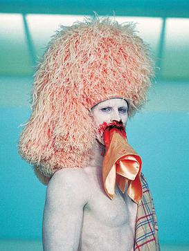
Rehearsal. (Courtesy of Local Ephemera.)

Rehearsal is another photo set that contradicts its title. Whereas the name suggests some sort of activity, the images instead convey a sense of repose, an almost intoxicated calm. An incredible red, like in red velvet cake or lipstick, complements shades of white and the vivid textures of fabric.

What is it a picture of, you ask? A man reclining on a couch. But as in the other arrays, Rehearsal is fragmented into a rigorous gestalt of angles and closeups. The effect approaches dizziness. Although Stephanie retains the grid structure for its installation, the layout is a little more aggressive, recalling the face of a mixed-up Rubik’s cube rather than an ordered, predictable chessboard.

As a whole, Time & Time gravitates toward scenery rather than shots of people. Although the bottom-right quarter of Persist (below) is a self-portrait, Stephanie uses cropping and strategically oblique poses to obfuscate the identity of her human subjects. The piece is really about color: salmon and turquoise and light shades of beige. Nothing in the show really struck me as what you’d traditionally call “portraiture.”

Persist (courtesy the artist)

Of course, we all “learned” these concepts back in Printmaking 101. The balance and unity of formal elements: color, shade, and movement. The trouble is – we tend to forget. After visiting so many shows dedicated to the fun vulgarity of D.I.Y. or to the celebration of Atlanta Lowbrow, it’s refreshing to encounter a young artist with a firm command of the basics.

* * *