Showing posts with label art review. Show all posts

Thursday, September 18, 2008

"Search for Truth . . . Promote Socialism"

Detail, Slogan 7 by Zhang Dali.

Striking the eyeballs like so many of those infamous hammers-with-iron-sickle, these ideograms form a static compositional grid. Baffled—with my face hovering a mere breath's distance from the vinyl surface—I attempted to "read" from left to right, and, quickly realizing my predictable, "amateur" error, I tried again vertically.1

But… I was still missing the point. Yes, the paintings are made of Chinese characters. (Each line spells out a slogan of Communist propaganda.) I realized, though, that the most dominant visual element here is the background void of solid black.

And this is what the full image looks like. What a sad, sad little boy... Zhang Dali opened his Slogans series at Kiang Gallery last Friday.

The color black. All other shades of value, including subdued hints of blue and brown, are contained, exclusively, within the tiny brushstrokes of Zhang Dali's lettering. What a potent statement: the figure can only be seen through the intermediary of state ideology.

We can only express our opinions with the vocabulary we're given:
PRACTICING GOOD MANNERS LEADS TO A BEAUTIFUL LIFE
PROMOTE SOCIALISM AND THE CONSTRUCTION OF A HARMONIOUS SOCIETY
And you don't have to experience the Cultural Revolution to sympathize. Just turn on the radio—the talking points repeat themselves over and over. Simply replace a single party with two.

Slogan A.4, on the other hand, has slightly more color.

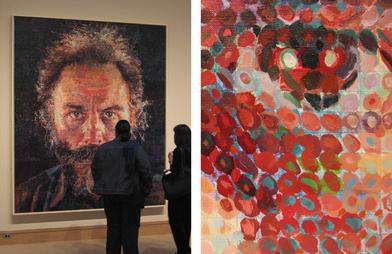
The content interests me, but I'm more inclined to treat these as a study of the human mark. Names like Chuck Close come to mind. While the grave subject matter demands an unfortunately limited color palette, the meticulous labor that went into each stroke does make the in-gallery experience more meaningful than simply viewing these photographs.

I'm reminded of Jonathan's thoughts on Local Ephemera about the significance of "duplicating text by hand." I'm still chewing on the question.

So begins "My Self-Education in Beijing Artists," Part 1…

Navy/Army/Airforce by Shen Jingdong (photo taken at China Square's exhibit booth at Art Santa Fe). Click for closeups of each panel: Navy, Army, and Airforce.

Compare Zhang's disciplined sobriety to Sheng Jingdong. Like the tarnished backside of a silvered mirror, Zhang shows us the emotional reality beneath the shiny surface. His portraits are a far cry from those well-fed, beaming faces of yesteryear. But Sheng's military renderings (above) have their own subversive charm. Those deadpan, bubblegum colors can't be serious.

Is this a generational difference between artists? Or simply a stylistic choice? I have so many questions. For example…

Demolition: Time Plaza Beijing, 1999. Reminds me of Banksy's "transparent" designs on the Israeli West Bank barrier.

Why does Chinese art cost so much?

Zhang made a name for himself creating activist graffiti in Beijing. These profile silhouettes (above) marked buildings slated for demolition, drawing public attention to the effects of "progress" on the city's anatomy.

Touted as "the only graffiti artist in Beijing" during the early 90s, Zhang's pseudonym was "AK-47." The tag appears in one of the Kiang Gallery pieces, repeating like a deadly postmodern sutra over some poor child's face.

But now Zhang's framed Slogan pieces sell for $52,000 each…


Of course, everyone's favorite graffiti artist, Banksy, just broke the $500,000 mark last year. His Space Girl and Bird (above) sold for "only" 288,000 pounds, roughly $576,000. However, that still doesn't put "the Beijing trend" into perspective.

I suppose I shouldn't consider it a serendipity that, less than a month after the Beijing Olympics, ARTNews magazine's cover story this month focuses on China's art market. To illustrate some of the recent incredible leaps in value, Barbara Pollack cites the case of Zheng Fanzhi: "Five years ago his works sold for under $50,000. Today he commands prices on the primary market closer to $1 million."2

Zhang's Chinese Offspring, an installation meditating the plight of migrant labor. Click here for a detail. Zhang's range is impressive; he completed this two-year sculptural series in 2005 before moving on to other media.

I don't mean to challenge Zhang's integrity. I just don't want to live in a world where the sex appeal of "graffiti" outstrips the word's credibility. And though I can certainly see the value of individual Chinese artists, the recent lust for "anything Beijing" should be treated for what it is: a trend.

---

1 I don't speak or read Chinese. Fortunately, technology amplifies my normal powers of deduction. The repetitions in Slogan 7 seem to indicate horizontal orientation. Slogan 13, judging by the placement of key words 社会主义 (Socialism) and 十七大 (the shortened name of the 17th National Congress), reads vertically, although from the bottom to the top instead of what you'd expect. The choices vary according to aesthetic. Correct me if I'm wrong…

2 Pollack's article is an excellent resource, especially for the illustrations in the print edition. It saves me the trouble. : )

Thursday, September 11, 2008

My What Big Eyes You… Have?

Eudora Welty Suit for My Cat, Toby—part of Linda Hall's show, The Beast in Me, at Young Blood Gallery. Now, just a little closer, dearie…

While Linda Hall's cat-costume monstrosities make me smile, her 2D works effectively ruin the experience. Her watercolors attempt a kind of children's book aesthetic that, while playful, feels forced and more than a little didactic.

Here's an excerpt in Hall's defense, written to accompany the show's signature costume, We Are What We Endanger (below):
Assuming the bear identity is my playful yet poignant way of forcing empathy… not unlike ancient rituals where a human assumes the spirit of the animal by wearing its skin. Here the viewer is invited to complicate entering the body of the Florida Black Bear, inhabiting its spirit, its power, and its plight. [emphasis mine.]
So… animals connect us? Sorry: somewhere between Hall's bird of prey and its aerial buffet of rodent-and-snake, I got completely lost.

The Black Bear homage, on the other hand, makes more sense. Its ragged textures and big, watery eyes suggest the neglect and malnourishment of a vagabond. As the artist intended, the bear looks pathetic.

But does it hold up to the craftsmanship of, say, the Center for Puppetry Arts? And, although the bear is fun, I wonder if its cartoon features hold it back, anesthetizing its inspirational power. The poles are contradictory—a "beast within" should have teeth, right?

Overall, I liked the "costumes" fashioned after Nick Cave, Eudora Welty, and, especially, Toby's Bird Watching Suit with its raised textures and play of gold-on-cream. But the watercolors really do suffer. The mounting, for instance, is dismal.

Effective naiveté certainly has its examples. I'm sure Linda Hall is a fan of Kiki Smith's folk tale series (e.g., Untitled, 2007 and Lying with the Wolf, 2001). Smith isn't my favorite, but her stab at the genre rings with a little more truth.

We Are What We Endanger. Sorry for the poor photo quality, but you get the idea.

*

Tuesday, August 26, 2008

Archeology of Omission

Group Seven collaborative show at Whitespace Gallery. The burns on this mammoth-sized abstract indicate some seriously intense heat. (Photos by Ben Grad. You can view a larger selection at Ben's Picasa site here.)

Group Seven is the local branch of The Imagillaboration Project, a nationwide network of sculptors collaborating through the exquisite corpse method first championed by André Breton and other French Surrealists.

The premise is simple: each sculptor creates a "seed," which, as it rotates between artists, evolves in a process of growth, dissection, and reassembly. Although some variations of the game are "blind," each participant here must consciously react to the additions made by the previous artist. Here's an example by Group Six, a peer group based in Ohio and Michigan.

Rather than a traditional, single-perspective review, I thought it would be appropriate to respond as a collective. In the spirit of the exquisite corpse, I'm joined by fellow bloggers:
Susannah Darrow (Il Faut Cultiver Notre Jardin)

and

Ben Grad (Proclaim It Lost)
The discussion below follows a similarly themed format; each writer picks one sculpture and begins a description, an inspirational "seed," to be continued by the other two.

Julia's Seed, collaborative sculpture.

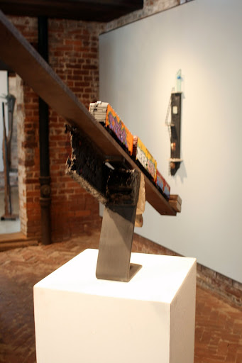
Ben: An iron filing bezoar perches atop an etched limestone pillar, itself balanced between the four legs of something like an inverted stool. There's an urge to describe the individual components of these structures—to ascribe an artist to each favorite material, structural element, or technique.

Susannah: In this desire to connect each material with a personalized identity, Group Seven’s exquisite corpse has proven itself quite successful. A personification of each artist can be seen in every scrap and oddity. Though this individualism within the sculpture has far from compromised the overall unity of the piece. Every rusted leg compliments the smoother, polished sphere that crowns the sculpture. The dreadlock-like tendrils mirror back at the rusted supports. No material is unconsidered and no placement arbitrary.

Jeremy: Although it might be interesting to play detective and link each component to a specific “author,” it would be a little exhausting. I’d rather not distract myself from appreciating the piece as a complete experience. With that said, I do see a kind of vague individualism. Although that sliver of wood—jutting like a slice of carrot alongside the central limestone column—is a very minor addition, it adds a bit of unexpected contrast. Compared to the outright eclecticism of Patrick’s Seed, Julia’s Seed achieves a very tasteful moderation between anonymous experimentation and editorial control. While I love Patrick’s Seed, with its little train cars and graffiti, there’s a greater cohesion here between each part.

Matt's Seed, a kinetic, collaborative sculpture. If you can find images no. 17 and 18, you can create your own "animation" by clicking back and forth.

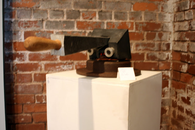
Susannah: There is a temptation to describe this work in the same sentiment as one would discuss items with a sense of childhood nostalgia. Each element of the sculpture has been worn-in considerably from playmate to playmate and assigned roles previously unimagined.

Jeremy: Nostalgia, perhaps… for sandbox games? I’m reminded of twig bridges over moats guarding towers of cold, red clay. Playing in dirt was always much more personal and interactive than pushing paper as an adult. Of course, sound effects were also important back then. I can almost hear this “mouse trap” growl and chomp and salivate (bluurrahhg!) for more. Its “mouth” is lined with ear plugs—which, as you pull the handle down—graze against a sculpted ear, perhaps allowing the monster to hear itself tasting itself.

Ben: Fetishes of “childhood nostalgia”… It's a fun image, but I find myself a bit left behind on this sculptural nostalgia train. This piece still has a core form, unlike Kate's Seed (below), which is a different sculpture each time its angle of orbit is shifted. In the hierarchy of nostalgia, Kate's Seed is Play-Doh, while Matt's Seed occupies the same position as action figures or three-wheeled bicycles.

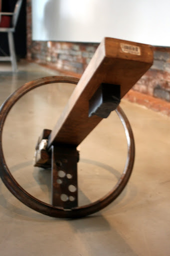
Kate's Seed, another kinetic collaboration.

All three: The kinetic sculpture humbly awaits human hands to send it rolling it into “orbit.” The materials list (bicycle wheels, a banana seat, iron, a kick stand, slate, bronze) is an archeology of omission.1

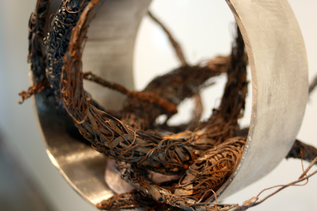
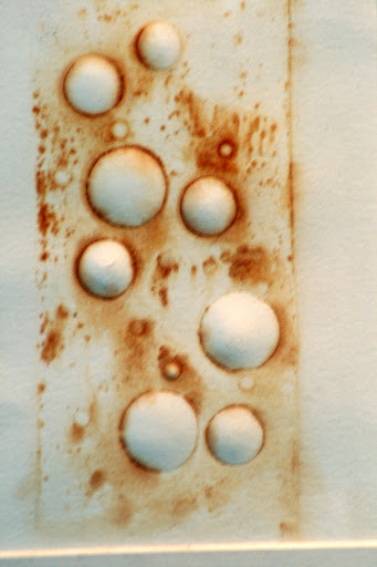
Layers of editing have reduced what would have been any cyclist’s wet iron dream into an earthbound satellite, circumscribed by the chakram of Zena, Warrior Princess… …translated into a A 2D companion piece, overlooks the fallen sculpture: bubbles of paper are surrounded by faint halos of rust—a copy of cut-out circle patterns on the satellite's inner connecting arm. A bar code sticker peels off the end of the 2x4 which stabs through Kate's Seed. Is that bar code yet another satellite? Should we be talking about the human condition now?

Let's skip all that babble. It's a stretch to describe Kate's Seed as a “wheel-within-a-wheel” nesting doll depiction of humanity. Instead, we should be sticking with what's both apparent and obviously intentioned in this piece: kinetics
, in all senses of the word. Every instance of positive and negative space within the sculpture describes anterior movements by its creators. The rust-embossed paper bubbles on a nearby wall seem to exist—by some fate—in parallel with the Swiss-cheese holes in the metal below. The remnants of age and destruction on the charred wood and the decrepit metals speak to past interactions unseen by the viewer. The wheel becomes both a demarcation for each part, intended to function within its boundaries, as well as the portal for transporting the sculpture outside of its allotted space. The transformation of each element in the structure allows Kate’s Seed to function more effectively than many of the other pieces. In such a minimal sculpture, the suggestion of outside forces leaves the viewer wanting to see the banana seat and the kick stand that have stayed behind the scenes.

---
1 The text formatting above indicates each writer's "voice":
Jeremy = plain text,
Ben = underlined, and
Susannah = italics
For my seed, I invited the other writers to delete, destroy, and edit the entry that came before. Although words can't replicate the effect of wood and metal, I hoped the overlapping text would approximate the collision of different sculptural styles and materials.
---

Group Seven closes this Saturday, Aug. 30,
with a special artist talk,
2PM, Whitespace Gallery.


Companion piece to Kate's Seed. The contours here are an actual impression of the sculpture (click for detail here).

***

Saturday, July 19, 2008

Lucky Number Seven (Off-Site)

[Continued from below.]

Story Line, multiple installations by Morse, Morse, and Simpson. I found this one at the Institute for American Indian Arts in downtown Santa Fe.

The sculptural "umbilical cord" above, Story Line, is made primarily of reclaimed junk. A continuous clay shell surrounds an inner core of rice, nylon, batting thread, and waddle. The three artists remark:
We are scavengers, exploring the aisles of Wal-Mart for batting material and stopping on the side of the road to inspect erosion blockers.
It's a very loose visual metaphor. Community is based on stories, and stories are connections - a thread of anecdotes told and retold in a mash-up of existing cultural materials. Notice the effort in matching the texture and color of Santa Fe architecture, a somewhat self-conscious throwback to the adobe structures of the Pueblo Indians.

Flashy technique is sacrificed for a kind of simplicity of message. The point is to create dialog – although an awkward and admittedly synthetic one – between existing local cultures and the various national and international institutions that the word "biennial" necessarily implies.


Here, Story Line silently invades downtown Santa Fe like some B-movie parasite. The "host" building is the Institute for American Indian Arts, a fine arts college and museum dedicated to Native American artists.

The sculpture encroaches on a promotional banner for the museum's Fritz Scholder collection. Though Scholder's work recalls the abstraction of Francis Bacon or perhaps Willem de Kooning, his subjects and his colors capture the flavor of the Southwest.


Erick Beltrán (Mexico), installations inside the courtyard of the Palace of the Governors museum. The pedestrians here are checking out the local "Portal Market," where Native Americans sell turquoise jewelry and other handmade tourist trinkets.

Beltrán's pieces are designed to evoke a cemetery marker. Although I'm not familiar with his model, he invites us to consider themes of generational heritage, mathematical diagrams and maps, and statistical trends in population and immigration. Even more so than Story Line, his "mosaics" are downplayed to the level of near-stealth.

There are 20 or more off-site installations, referred to as "Hot Spots," located at 14 partner institutions in the greater Santa Fe area. Sometimes the only clear indication is


a simple metallic plaque, as if to confirm that ghostly feeling:

Yes... You are in the presence of Art.

The biennial piece above was installed at a sculpture garden populated with things like "Mr. Dog-Man" and this serene "Mistress of the Desert":

The effect is seamless; it really looks like it always belonged there. I like to think of it as a simulated ambiance.

A full integration with the everyday, attempted at the risk of misinterpretation or, worse, accidental negligence. The placement causes occasional moments of "conversation" with objects of the established visual order, especially those we tend to take for granted.

Luchezar Boyadjiev (Bulgaria), also located at the Palace of the Governors.

Details.

Art as Democracy: as with most elections in this country, the problem is participation. Luchezar Boyadjiev invites passersby to write a response to Lucky Number Seven using seven words or less.

The boards appear throughout town, but the most prominent contributions are naïve little drawings, photos of artistic process, and words by biennial participants "pumping each other up."

Luchezar, another "Hot Spot" at the Georgia O'Keeffe Museum, juxtaposed with...

...one of the museum's sculptures. We'll call it "Serpent of the Eternal Return."

The idea wasn't a failure; I thought these messages were a lot of fun. But I found the SITE installation at the Georgia O'Keeffe Museum, for example, precisely because I was looking for it.

It was behind a closed gate, and although the museum guard encouraged me to enter, no one else had entered the courtyard that afternoon. The pen provided, an expense account purchase from Office Depot, was nearly illegible due the rains of Santa Fe's "monsoon season."

The staff at SITE Santa Fe was extremely helpful. Southerners have high standards of hospitality. I wasn't disappointed.

Of course, these pitfalls are natural to a project of this scale. SITE is basically Santa Fe's equivalent of Eyedrum Gallery or perhaps the Atlanta Contemporary. But while the intimidation factor remains admirably low, the range of city-wide partnerships and transnational collaboration is impressive for a town of this size.

Over the course of seven years, the SITE team has cultivated the resources necessary to increase the scale.

**

Thursday, July 17, 2008

Lucky Number Seven (On-Site)

Two-level layout at Lucky Number Seven. Click here for more exhibition photos.

Architects Tod Williams and Billie Tsien, the final two credits listed in the initial gallery, donated the design pro bono. The gallery foundation, unfortunately, had to finance the builders through the usual means.

Ideals of community space – SITE Santa Fe's 7th biennial, titled Lucky Number Seven, finds its most direct mission statement in the words of its architects:
We see architecture as an act of profound optimism. Its foundation lies in believing that it is possible to make places on earth that can give a sense of grace to life and in believing that that matters.
- Tod Williams and Billie Tsien.
Although the project involved dozens of international artists, staff, and volunteers, the design is what really drives the on-site exhibition. The gallery is divided into cavernous, interlocking cells like a futuristic beehive. Visitors encounter walls at lateral angles and climb long rising inclines; most every installation can be seen from one of two floors.

Everything - including the videos, sculptures, and off-site installations - is executed with the same intention: to maximize the accidental, personal qualities of each viewer's experience, possibly in an attempt at what Nicolas Bourriaud calls "relational aesthetics." I believe the phrase used in one artist statement was “art as democracy.”

Does it work? Conceptually, yes. But in terms of substance and pure aesthetic excitement, something is missing... Unfortunately, I’m not sure what.

The Fourth Ladder, interactive projection by Studio Azzurrio (Italy).

"Mr. Eyepatch" appears in more than one video. He is officially awesome.

As several larger-than-life figures walk from left to right, the viewer can touch the wall and activate a recorded message. The chosen "character" stops mid-stride, turns toward the audience, and speaks, giving directions around Santa Fe, commenting on the weather, or other snippets of local wisdom. Here's an excerpt from the artist statement:
A high potentiality of connection [due to modern technology] corresponds to a low ability of relation … The intense gesture of stopping one of the many characters passing by and detaining him with your hand expresses the desire of contact. It shows the necessity of getting in touch.
- Studio Azzurro, artist statement.
Although the artists generally came from out of town (from the US and overseas), each was required to create their pieces in Santa Fe, using local materials and styles. Judging from my experience, the characters in the projection appear to be bona fide New Mexicans.

10-20 video screens lined a corridor between the first two galleries. I happened to bump into the artist behind this piece; she was surprisingly young. According to website, the team was a diverse "20s and up" crowd.

More and more video. I didn't really understand this piece, but I was struck by the surreal contrast between the completely serene audience at right and the flailing gesticulations of the rock band at left. It was like they were playing a concert for the third world...

"Umbilical" sculptural installation by Eliza Naranjo Morse, Nora Naranjo Morse, and Rose B. Simpson. These were paralleled by off-site creations in downtown Santa Fe. More in the next post...

Unlike the multimedia entires, the two-dimensional works were surprisingly juvenile. In keeping with the mission of biodegradable, disposable ephemera, each drawing was performed on standard size paper and tacked, unframed, to the naked wall surface. I respect the intention – maintaining a casual, and therefore more democratic, atmosphere - but a lot of the drawings just looked poor.


Drawings and found object by Hiroshi Fuji (Japan).

Hiroshi Fuji's drawings, on the other hand, were more inspired. Apparently, his usual media include garbage and abandoned toys. Here, he appears to follow Takashi Murakami's aesthetic of Tokyo pop/fine art fusion. It's too bad I didn't make it out to photograph his epic-scale installation at the Santa Fe Opera, one of the more hyped entries to the biennial...

Damn.

[Continued above.]

**

Thursday, June 26, 2008

The Yellow Brick Road..?

(Late Review No. 2; revised.)

Dorothy's Tornado by Ron Balser. An inscription reads: "The yellow brick road leads only to your self."

"Electronic prose" by Ronald Davis Balser at Fay Gold Gallery. The granite bench at left is also by Balser. (Images courtesy of the artist and Fay Gold Gallery.)
Pay no attention to that man behind the curtain.
- The Wizard of Oz

And in the case of the avant-garde, this was provided by an elite among the ruling class of that society from which it assumed itself to be cut off, but to which it has always remained attached by an umbilical cord of gold.
- Clement Greenberg, from “Avant-Garde and Kitsch”
Appropriating the vocabulary of finance, Ronald Davis Balser calls his new operation Balser Art Ventures. The name suggests, by phonetic similarity, a journey of “adventures.” His sculptures are functional; he makes marble benches engraved with motivational snippets of “fatherly advice.”
GO FORTH! TAKE RISKS!! SEEK TRUTH!!!
The clean lines and consistent typeset indicate the use of lasers. Although I’ll admit the craftsmanship in works such as See the World has improved, the sculptures are incredibly pedestrian overall. In an attempt at poetic aphorism, the inscriptions assume a surprisingly low level of literacy.

You can see a clear example of Ron Balser's electronic marquees on his website. The sample message reads:
Today’s rootstock is tomorrow’s harvest… sow with due care and deliberate haste.
Hoard from the spring vines the blossoms of love & life…
Even pessimist cannot deny possibilities.
Although Ron acknowledges inspiration from Jenny Holzer's famous truisms, he says her work is a little too "negative." Here's one of my favorites by Holzer:

Private Property Created Crime by Jenny Holzer. Yes, that is Times Square. This was a project completed in 1985.

Although the term "revolutionary" would be a bad pun, Holzer's work expanded the practical boundaries of public art.1 We all remember Daniel Canogar's Clandestinos... Correct me if I'm wrong, but I believe Holzer innovated the practice of politicized projections on public buildings and monuments. Plus that installation at the Guggenheim was fabulous. Nothing says "Big Brother" more than 360 degrees of propaganda. I wish I had seen it in person.

Jenny Holzer, Truism Bench.

Surprise surprise. I had no idea Holzer also made benches..! One of these is currently located in Columbus Park in Brooklyn, NY. The message facing us reads:
IT’S A GIFT TO THE WORLD NOT TO HAVE CHILDREN
NOTHING UPSETS THE BALANCE OF GOOD AND EVIL.
I suppose I can understand Balser's apprehension. Considering his background, Jenny Holzer's confrontational message is probably wholly incompatible with his worldview. Balser is the founder of Balsor Companies, an insurance consultancy located in Atlanta. His aesthetic training is rather recent, and it shows.

Holzer, on the other hand, is a member of the art circle descending from Second-wave feminism. Although feminists were, and continue to be, women of all colors and beliefs, the bulk of Holzer's truisms intersect with Leftist ideology. "Private Property Created Crime" is a position of historical materialism.

I'll keep my political opinions to myself, but I know I have more than one feminist reader, so I'm curious: Are these ideas dated? How do you separate the question of gender liberation in these works from the question of general liberation?

Compared to Holzer's deliberately subversive aphorisms, Ron's message - in terms of attitude and political subtext - seems like a diametric opposite:

This sculpture, Bill & Bernie's, can be seen at the Georgia Aquarium. It was created in honor of Bernie Marcus, the renowned aquarium mogul and CEO of Home Depot.

The Successful.

Ron Balser, Go Forth 2. This is a copy of the bench placed on the campus of Emory University, located at the Goizueta Business School.

Allow me to use the language of the financial world: if I was an Emory alumnus, this would not inspire me to donate to the Alma Mater. Balser's truisms are, by design, drained of all political content. If you ask me, they read a lot like corporate slogans. An appropriate lawn decor for the American robber baron.

Aesthetically, I find these sculptures boring. However, this is a statement that - by logical extension - I'm willing to make towards Jenny Holzer's bench. Her benches weren't very interesting either. But the physical form isn't what gives her work value. As in her Times Square piece above, her success is due to a combination of her textual content, its spacial placement within the public sphere, and, above all, the professional bravado involved in getting it up there. Balser's benches have no such redeeming qualities.

And then there's the question of originality. Balser's work is an awful lot like that of a well-known, established artist. Although the industry, for some time now, has looked favorably on the practice of mimicry and appropriation, I wonder: do these works qualify as an appropriately "recontextualized" use of someone else's ideas?

I'll leave this to my readers to decide.

I will say that the green sculpture in the middle, See the World, did show promise. The red glow from left glinted on the marble surface as I walked by. The asking price on Balser's website is $90,000... I'm no sculptor and I certainly have little experience with public art. Could someone educate me please?

The two exhibitions, Balser and a photographer named Arno Minnkinen, overlapped in this corner. The experience was surreal. A few people around me were talking about corporate dinners... It reminded me of back when I worked in this building.

--

1 You can read more about public space and Jenny Holzer here.

* - *