Tuesday, August 25, 2009

[updated] Deanna Sirlin at Whitespace

Review|Deanna Sirlin: Everything is Optional
Whitespace Gallery; April 17—May 16, 2009; ArtVoices, June 2009


Deanna Sirlin compares her work to the lecture style of Salman Rushdie, the current writer-in-residence at Emory University: Her circular brushstrokes are “like” Rushdie’s baffling circles of logic that, through a sublime intellectual sleight-of-hand, achieve clarity at the last possible moment. Of course, Sirlin’s paintings and Salman Rushdie have about as much in common … as horseshoe crabs and swine flu. Still, even if Sirlin’s very (and truly) harmless simile falls short, it raises the more interesting question of interpretation and translation.

Take for instance 33 1/3, a work Sirlin installed at the New Orleans Museum of Art in 2001. 33 1/3 is essentially an abstract painting, produced by hand and then digitally blown up and superimposed on an existing museum window. The product is a semitransparent floor-to-ceiling image; you can’t see through the window per se, but it permits the free passage of sunlight by day, or museum lights by night. 33 1/3’s numerical title refers to the revolutions of a spinning record, an association designed to pay homage to New Orleans’ music. As in her other public art projects, Sirlin attempts to match her “perception of the site buildings’ architecture” and the flavor of “the city in which they are a part.” So … is the work a successful translation of New Orleans culture?

Everything is Optional, Sirlin’s latest exhibition at Whitespace Gallery, is concerned with the process of translation. Less so in her large-scale abstractions (executed in the same style as her public art paintings, but without a digital intermediary), Sirlin’s installations are sculptural translations—from the language of two-dimensional drawing to that of metal. Each work began as a tiny drawing in Sharpie marker that, as before, is then blown up and programmed into a machine. The finished sculptures are irrevocably physical, metallic incarnations of abstract line: circles, ellipses, and, for lack of a better word, squiggles. The works are interesting, insofar as they both evade recognition while still recalling the sinuous strokes of the original Sharpie. But in this case, the virtue is also a vice: Sirlin’s “translations” seem little improved over the breakfast-table exercises they initially were. Further, her use of technology as a transformative medium fails to surpass the ingenuity of local artists half her age (see my comments on Kathryn Refi’s Color Recordings, ArtVoices, October, 2008, p. 44).

Of course, the comparison wouldn’t be necessary if Sirlin didn’t market herself as an artist of “digital media.” Although I’m generally not a fan of primary colors, her large traditional paintings show a confident command of asymmetry, a fact no doubt solidified by her 30 years’ experience in the medium.

And although her New Orleans installation, 33 1/3, is neither an interpretation nor a translation of the city in which it lives, the painting style at least incorporates the host building’s architecture. The work succeeds in signifying a bland and very tame modernism, an apolitical escapism of color, in which vanity exceeds substance.

***

[updated] William Boling and Corinne Vionnet

Review|William Boling and Corinne Vionnet: Complete Desire
Opal Gallery; February 12—April 4, 2009; ArtVoices, May 2009


Laughter, forgetting, globalization, alienation — I see many things in Complete Desire, the photographic collaboration by William Boling and Corinne Vionnet. But at first I had difficulty seeing anything that resembled “completion” or “desire.”

The series is organized into triptychs of seemingly unrelated images from geographically distinct locales. The left-hand photo of Panel No. 18, for instance, captures a moment in Vionnet’s home in Vevey, Switzerland, while the right-hand side is a patch of green space near Atlanta’s East Lake transit station. Snapshots taken by Vionnet include Villefontaine, France, Kew Garden in London, and even a “train for Geneva.” By contrast, Boling’s photos were taken within the United States during various daytrips throughout Georgia. Boling and Vionnet met over the internet and, until the exhibition opening, “spoke” almost exclusively though images instead of words.

The “completion/desire” puzzle only deepens when one considers the two-year process used to create Complete Desire: One artist emailed the first image to the other who — without “peeking” — responded with a second image. The images were then revealed, and the second artist completed the triptych by choosing the final image. Each work, then, is not only the product of two creative minds but also a significant degree of chance.

So, desire is metaphorically “completed” through a kind of modified Hegelian dialectic, a fact that makes works such as Panel No. 16 all the more interesting. In the first image, we see a vehicle interior centered on a pair of female legs in stockings. A thumb enters the picture from below; the subtle contrast — between her pale skin and dark nylons (covered v. uncovered flesh) — evokes a sense of vulnerability. The femininity, in turn, contrasts with the genderless icons in the photo on our right, a closeup of a car dashboard. Isolated out of context, each icon “represents” a generic, almost hieroglyphic human being, shown in profile without arms (or even a neck). The air conditioner dial directs our eyes to the little arrow pointing to the passenger’s knees, an almost knowing gesture towards the female knees at left, as well as the man kneeling in the scene at center: a long exterior shot that looks down on an all but deserted neighborhood street.

Is this man locked out of the car? By the same woman who, embarrassed to look him in the eye, is staring at her lap (or at random dials on the dashboard)? Perhaps the central photo — viewed through a building window (evidenced by tell-tale reflections and glares of sunlight) — was taken by a private detective? Of course, domestic betrayal is merely one of many possible interpretations.

The visual themes mentioned above recur throughout the series: human figures visible only in profile, or in partial anatomy; obscured vision, often blurred by motorized travel; or scenes visible only through glass or reflections in a rear view mirror. Complete Desire follows an aesthetic of modern estrangement that, by willfully engaging in alienation, exorcises it by way of catharsis.

**

Friday, July 31, 2009

[updated] Drew Conrad: Cowboys, Lovers ...

Review|Drew Conrad: Cowboys, Lovers, Losers & Nobodies
Get This! Gallery; January 24—March 28, 2009


On the cover|Elizabeth Catlett
ArtVoices, April 2009


*

Tuesday, June 23, 2009

Pyrokinesis on the horizon; ArtVoices is available now, near you

On the cover|Eschatology by John Barnes, Jr.

[NOTE] I checked Barnes & Noble at Edgewood yesterday; there are several copies of ArtVoices still available (featuring my review of Deanna Sirlin's recent exhibition at Whitespace)! See also ArtVoices' shiny new website.

The prevailing wisdom tells me that summer is not a great season for arts in Atlanta. It's too hot, they say. There's nothing going on, they say, or at least there's nothing worth sticking around for.

Please allow me to disagree. Yes, the heat is abysmal, and although it exacerbates other commonplace annoyances (the smog gets worse), I consider it essential to the character of the place. I appreciate it, and I'm pleased to admit that though I've planned a short vacation elsewhere it will be even hotter than here.

I've been pleasantly distracted these past few months. GATHER Atlanta was a success that, to be honest, exceeded my expectations brilliantly. But it was exhausting. Subsequently, I've neglected a few things here and there, including my as yet part-time career as a freelance writer.

The three posts below are placeholders. (Scans are on the way.) Ghostmap Microwave is the blog that ties all my projects together; I'll be filling in the blanks below over the coming weeks, so, please, keep checking here for new updates!

The fireworks begin in July.

*

Monday, May 11, 2009

ART PAPERS!?! Yeah, Boyyeeeeee!

Published: This is not a clip.
Right there.Review|Richard Fleming.
[Whitespace Gallery; January 16 – February 29]
My byline is right there (p.56). As promised.


This could be you|On newsstands now (Barnes & Noble, etc., in major US cities, and select locations in Europe).

On the cover|Bizarro sculptures by Nick Cave.

Special thanks to Joyce Youmans (pictured above), an excellent friend and proofreader, and to k.tauches, who confirmed one of my suspicions, re: photo resolution.

::: )

*

Thursday, March 19, 2009

Thanks Maggie,

Maggie White posts this photo of yours truly, along with a link to our interview posted to BurnAway.org earlier this month.

TX!!
*

Thursday, March 12, 2009

Creative Loafing: Culture Surfing blog

Culture Surfing, CL's new arts and entertainment blog, officially "hard launched" this week. Basically, all of the newspaper's online A&E content will move from Fresh Loaf to the new address.

Main page:
Click for Culture Surfing here.

and...

Today:
Dosa Kim + Beep Beep preview

and, for the industrious...

Updates on all my posts:
Author Archive for Jeremy Abernathy

*

Monday, February 23, 2009

I now write for Creative Loafing,

as a part-time blogger for Cl's Fresh Loaf. Look out for new posts on ATL visual arts every week.

Exhibit A (today's post):
Beth Lilly ACP Public Art

Exhibit B (linking all my posts for CL):
Author Archive for Jeremy Abernathy

::: )

Sunday, January 25, 2009

Alan Loehle + Majestic Hours|ArtVoices January

On the cover|Jose Maria Cundin

Feature|Alan Loehle (p.15)
[Marcia Wood Gallery; January 8 – February 14; artist talk January 31]


Review|Sam Parker + Joe Tsambiras: Majestic Hours (p.40)
[Beep Beep Gallery; November 14–30]


*ArtVoices is a full-color monthly based in New Orleans. You can order a subscription here. Advertising and distribution requests should be directed to: sanders_410@hotmail.com

Tuesday, December 23, 2008

ArtVoices + December = Profanity?

One feature article (1,000 words) and one review:

Feature Berlin, Barcodes, and Back: An Interview with Christopher Hauck (p.11)

Review Jason Kofke: Everything Will Be OK and Ted Ullrich: The Wall
[Art House Co-op + Le Flash; October 24] (p.62)


On the Cover Lovely, anonymous people raising one hand in an unexplained gesture. I wonder what would dear Laurie Anderson say? (Or that fellow in Hal Foster's celebrated postmodern handbook?)

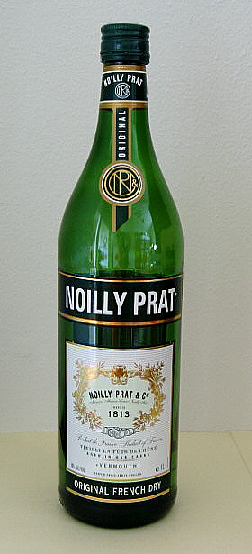
Sorry everyone—I broke my own rule and published a transcribed interview, instead of first translating it into a more rigorous piece of interpretive criticism. Although it's a more or less "straight up" interview, that is, one without crushed ice or even vermouth for flavor, I hope you'll at least find some value.

The title of this post refers to the use of profanity in the December cover story. In a giant, bold-face pull quote, Terrence Sanders speaks for many artists living and working in the South:
WHAT AM I SUPPOSED TO DO, WAIT WAIT FOR ART IN AMERICA OR ARTFORUM TO COME DOWN HERE AND COVER ME? FUCK THAT.
Keep in mind the context: these words are pulled from an interview and, further, an informal moment caught on tape. For me though, you could easily replace the "cover me" in Sanders' quote with "cover us."

The article mystifies me; this may be the first issue worth analyzing at length (which I may do at a later date). For now, I'll at least make my general opinion clear: Terrence Sanders' art does not appeal to me, but I respect what he's doing with ArtVoices and think that braver, more comprehensive arts coverage is what we need in this region.

We all know—thanks to Bob Dylan—that "love" is just a four-letter word. More unorthodox types, however, still insist on spelling it with an F, followed shortly by the letters U, C, and K. This is a man who loves his home. Terrence Sanders is either a high-functioning madman or an unhappily reincarnated Persian Immortal (as envisioned by Frank Miller). We hope for good things in the future.

Also in ArtVoices December: "Will Castleberry Hill Ever Become Atlanta's Version of Chelsea?" by Philip Auslander, a short history and exploration of the challenges facing the arts district.

I'm not familiar with this writer; along with other yet-to-be names, his byline continues in ArtVoices during my absence. (After the upcoming January issue, I take a break from A&E freelance until the end of this spring's legislative session.) Can anyone vouch for the guy?

And with that, Ghostmap signs off for the New Year.

Luv,

::: )

*ArtVoices is a full-color monthly based in New Orleans. You can order a subscription here or, alternatively, a very inexpensive, digital subscription through Zinio for a mere $20. Consider it an effort in tree conservation. (Advertising and distribution requests should be directed to: sanders_410@hotmail.com)

Tuesday, November 18, 2008

Two Reviews in ArtVoices November

Writing by yours truly in this month's ArtVoices. It's always nice when you get to quote Mircea Eliade in a review...

Click below to read more:

ACP Public Art: "Within Our Gates"by Bradley McCallum and Jaqueline Tarry

Zhang Dali at Kiang Gallery


Wednesday, October 15, 2008

Published: Two Reviews in ArtVoices

Due to the soaring costs of fuel (and basically everything else on the planet), the latest issue ArtVoices magazine comes in limited supply and is vanishing rapidly. Solomon Projects, for instance, is already out.

To save you the frustration, I've provided my two Atlanta reviews here in facsimile:

Jody Fausett at Whitespace Gallery

Kathryn Refi at Solomon Projects

I'm in the second column. Toward the middle. ::: )

Photo by Michelle Elmore, who owns a new gallery in New Orleans. A friend once suggested that gold teeth were a symbol of the city, and, curious, Elmore decided to find as many as she could. Luv that facial hair...

ArtVoices is based in New Orleans, where big things are coming together as we speak, including the international arts shindig, Prospect.1. They're calling it a biennial, so add one more to the growing list.

(I assume each subsequent expo will be called Prospect.2, 3, 4, ad nauseam. Is that such a good idea?)

Anyone planning a trip to NOLA? It starts the weekend of Nov. 1.

Monday, October 06, 2008

Announcing a NEW BLOG


Burn Away, our new visual arts blog, launches today. The address is:

Expect good things.

Yeees.

::: )

Tuesday, September 23, 2008

So, Who Are These "Beautiful" People ?

Trailer for Beautiful Losers, a documentary about a group of artists loosely associated with Alleged Gallery (NYC) during the 90s.

I'm just guessing, but I'm sure I saw a lot of you people at the Beautiful Losers screening at the Plaza Theatre last Thursday. You know who you are. : )

I didn't know what to expect, but I came away glad. You could feel by the energy in the room, filled with students and artists of various ages, that people identified with the artists in the film. I spend so much time trying to "bring the serious" that it's easy to forget why I started: I saw people around me creating personal, inspired art and, acknowledging a power I could never achieve, I wanted to support them in what ways I can.

So, I suppose I should start learning who these "beautiful" people are...
Artists from the movie, new to me:
Aaron Rose
Barry McGee
Chris Johanson
Ed Templeton
Geoff McFetridge
Harmony Korine
Jo Jackson
Margaret Killgallen
Mike Mills
Deanna Templeton
Stephen Powers
Thomas Campbell
Cheryl Dunn
Now where do I start...?

Thursday, September 18, 2008

"Search for Truth . . . Promote Socialism"

Detail, Slogan 7 by Zhang Dali.

Striking the eyeballs like so many of those infamous hammers-with-iron-sickle, these ideograms form a static compositional grid. Baffled—with my face hovering a mere breath's distance from the vinyl surface—I attempted to "read" from left to right, and, quickly realizing my predictable, "amateur" error, I tried again vertically.1

But… I was still missing the point. Yes, the paintings are made of Chinese characters. (Each line spells out a slogan of Communist propaganda.) I realized, though, that the most dominant visual element here is the background void of solid black.

And this is what the full image looks like. What a sad, sad little boy... Zhang Dali opened his Slogans series at Kiang Gallery last Friday.

The color black. All other shades of value, including subdued hints of blue and brown, are contained, exclusively, within the tiny brushstrokes of Zhang Dali's lettering. What a potent statement: the figure can only be seen through the intermediary of state ideology.

We can only express our opinions with the vocabulary we're given:
PRACTICING GOOD MANNERS LEADS TO A BEAUTIFUL LIFE
PROMOTE SOCIALISM AND THE CONSTRUCTION OF A HARMONIOUS SOCIETY
And you don't have to experience the Cultural Revolution to sympathize. Just turn on the radio—the talking points repeat themselves over and over. Simply replace a single party with two.

Slogan A.4, on the other hand, has slightly more color.

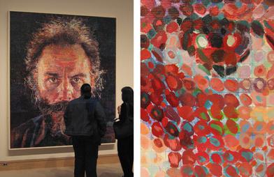
The content interests me, but I'm more inclined to treat these as a study of the human mark. Names like Chuck Close come to mind. While the grave subject matter demands an unfortunately limited color palette, the meticulous labor that went into each stroke does make the in-gallery experience more meaningful than simply viewing these photographs.

I'm reminded of Jonathan's thoughts on Local Ephemera about the significance of "duplicating text by hand." I'm still chewing on the question.

So begins "My Self-Education in Beijing Artists," Part 1…

Navy/Army/Airforce by Shen Jingdong (photo taken at China Square's exhibit booth at Art Santa Fe). Click for closeups of each panel: Navy, Army, and Airforce.

Compare Zhang's disciplined sobriety to Sheng Jingdong. Like the tarnished backside of a silvered mirror, Zhang shows us the emotional reality beneath the shiny surface. His portraits are a far cry from those well-fed, beaming faces of yesteryear. But Sheng's military renderings (above) have their own subversive charm. Those deadpan, bubblegum colors can't be serious.

Is this a generational difference between artists? Or simply a stylistic choice? I have so many questions. For example…

Demolition: Time Plaza Beijing, 1999. Reminds me of Banksy's "transparent" designs on the Israeli West Bank barrier.

Why does Chinese art cost so much?

Zhang made a name for himself creating activist graffiti in Beijing. These profile silhouettes (above) marked buildings slated for demolition, drawing public attention to the effects of "progress" on the city's anatomy.

Touted as "the only graffiti artist in Beijing" during the early 90s, Zhang's pseudonym was "AK-47." The tag appears in one of the Kiang Gallery pieces, repeating like a deadly postmodern sutra over some poor child's face.

But now Zhang's framed Slogan pieces sell for $52,000 each…


Of course, everyone's favorite graffiti artist, Banksy, just broke the $500,000 mark last year. His Space Girl and Bird (above) sold for "only" 288,000 pounds, roughly $576,000. However, that still doesn't put "the Beijing trend" into perspective.

I suppose I shouldn't consider it a serendipity that, less than a month after the Beijing Olympics, ARTNews magazine's cover story this month focuses on China's art market. To illustrate some of the recent incredible leaps in value, Barbara Pollack cites the case of Zheng Fanzhi: "Five years ago his works sold for under $50,000. Today he commands prices on the primary market closer to $1 million."2

Zhang's Chinese Offspring, an installation meditating the plight of migrant labor. Click here for a detail. Zhang's range is impressive; he completed this two-year sculptural series in 2005 before moving on to other media.

I don't mean to challenge Zhang's integrity. I just don't want to live in a world where the sex appeal of "graffiti" outstrips the word's credibility. And though I can certainly see the value of individual Chinese artists, the recent lust for "anything Beijing" should be treated for what it is: a trend.

---

1 I don't speak or read Chinese. Fortunately, technology amplifies my normal powers of deduction. The repetitions in Slogan 7 seem to indicate horizontal orientation. Slogan 13, judging by the placement of key words 社会主义 (Socialism) and 十七大 (the shortened name of the 17th National Congress), reads vertically, although from the bottom to the top instead of what you'd expect. The choices vary according to aesthetic. Correct me if I'm wrong…

2 Pollack's article is an excellent resource, especially for the illustrations in the print edition. It saves me the trouble. : )

Monday, September 15, 2008

McCloud Speaks at Agnes Scott

From Understanding Comics by Scott McCloud (1993). ISBN# 006097625X.

15 years ago, Scott McCloud introduced Understanding Comics, a comic book about comic books that, in an easy-to-digest form, discussed the medium with a smattering of art history and theory and, above all, a desire for stories with something more than just explosions and bad dialog.

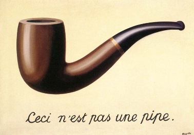
McCloud's clever little diagram, for example, is a pretty original innovation. Plus I'm young enough to admit: reading McCloud in the 90s "got me into" René Magritte's Treachery of Images.

McCloud lectures on "A Medium in Transition" tomorrow night, 7:30PM, at Agnes Scott.

Thursday, September 11, 2008

My What Big Eyes You… Have?

Eudora Welty Suit for My Cat, Toby—part of Linda Hall's show, The Beast in Me, at Young Blood Gallery. Now, just a little closer, dearie…

While Linda Hall's cat-costume monstrosities make me smile, her 2D works effectively ruin the experience. Her watercolors attempt a kind of children's book aesthetic that, while playful, feels forced and more than a little didactic.

Here's an excerpt in Hall's defense, written to accompany the show's signature costume, We Are What We Endanger (below):
Assuming the bear identity is my playful yet poignant way of forcing empathy… not unlike ancient rituals where a human assumes the spirit of the animal by wearing its skin. Here the viewer is invited to complicate entering the body of the Florida Black Bear, inhabiting its spirit, its power, and its plight. [emphasis mine.]
So… animals connect us? Sorry: somewhere between Hall's bird of prey and its aerial buffet of rodent-and-snake, I got completely lost.

The Black Bear homage, on the other hand, makes more sense. Its ragged textures and big, watery eyes suggest the neglect and malnourishment of a vagabond. As the artist intended, the bear looks pathetic.

But does it hold up to the craftsmanship of, say, the Center for Puppetry Arts? And, although the bear is fun, I wonder if its cartoon features hold it back, anesthetizing its inspirational power. The poles are contradictory—a "beast within" should have teeth, right?

Overall, I liked the "costumes" fashioned after Nick Cave, Eudora Welty, and, especially, Toby's Bird Watching Suit with its raised textures and play of gold-on-cream. But the watercolors really do suffer. The mounting, for instance, is dismal.

Effective naiveté certainly has its examples. I'm sure Linda Hall is a fan of Kiki Smith's folk tale series (e.g., Untitled, 2007 and Lying with the Wolf, 2001). Smith isn't my favorite, but her stab at the genre rings with a little more truth.

We Are What We Endanger. Sorry for the poor photo quality, but you get the idea.

*

Monday, September 08, 2008

"What We Endanger..."

Linda Hall, Bird Watching Suit for My Cat, Toby.

Conjuring Change.

Nick Cave Suit for My Cat, Toby.

Crow Stomach.

Animals Connect Us.

The Beast in Me
Young Blood Gallery
9.6.08 - 9.28.08


*

Friday, September 05, 2008

I'm told

that Japanese gardens were once called shima (島), a word that means "island," rather than the common word used for "garden" today.

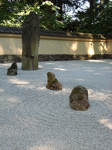
Portland's Japanese Garden. You can view the webgallery here.

Languages change and spread, as if commanded to frustrate their physical containers—on the atlas and in our clumsy vocal cords. Fortunately, translations are still possible.

Try typing "japanese garden" into Google: Portland is actually the top hit. Although firmly locked within the continental US, the landscaping is faithful to the wabi-sabi aesthetic originated over on "that island."

Things I like:
1. This rock garden
2. This lion statue, also known as Mr. Grumpy
3. This contemporary sculpture by Jun Kaneko.
Context changes everything. Though these ordinary, Crayola hues usually put me to sleep, the contrast of bright-pastel-on-earth makes for a surprising seamlessness between old and new. The glass is just a little translucent.

Can we have more art outside?

Wednesday, September 03, 2008

Upper Playground

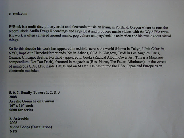
Deadly Towers 1, 2 & 3 (acrylic) and Asteroids (multi-media installation) by E*Roc. Click here for artist statement. I'm reminded of 1) Matt Relkin's towers and 2) Bean Summer's recent installation at MINT...

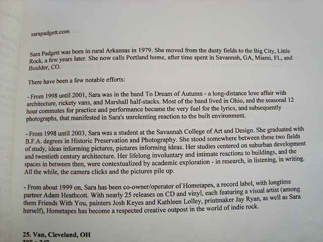
Photos by Sara Padgett: Watermelons, Miami, FL and Multitubes, Savannah, GA. Artist statement here. Those colors are exquisite. Padgett, an Arkansas native, confirms the sensation that Portland is also a "town of transplants."

Upper Playground is a design studio based in San Francisco. They also run two art galleries: Fifty 24SF and Fifty 24PDX. Kudos to Mike Germon for pointing the way.

I visited their Portland, OR, location this summer, and although I've delayed the photos for some time, I'm proud that I was able to attribute the artist to each and every work. It was a rare show for the space; instead of showcasing "established" talent from the California art scene, Seven was exclusively dedicated to rising artists in Portland. Fifth and Couch posted some photos of the opening here.

Feel free to browse the Picasa webgallery here
.

Comments appreciated!